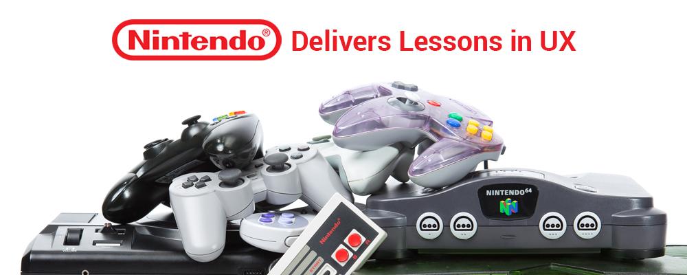
Nintendo Delivers Lessons in UX with the New Switch
Remember when the Wii and the Nintendo DS first came out? They created the biggest buzz in the gaming world because of their revolutionary user experience (UX). The Wii featured innovative motion-sensing, gesture-recognition technology, while the DS featured a novel folding dual screen and touchscreen technology.
Nintendo is at it again, this time with its new Nintendo Switch gaming system, set to launch in March 2017.
For designers that design for interactive products, this is exciting news. Here’s why.
Thanks to ingenious design, the Switch offers a consistent gaming experience across three very different configurations. That's big news. And, it allows Nintendo to deliver both versatility and the exceptional user experience the company is known for.
About Switch
What makes the Switch unique is the flexibility of configurations. The Switch features two detachable Joy-Con controllers, a Joy-Con console, and a Joy-Con console dock. These mini handheld controllers can slide onto the console (a portable screen), turning the Switch into a cool handheld game. Think Game Boy.
Or, the Joy-Con controllers can be used one in each hand with the console propped up using its integrated kickstand, to mimic the traditional tv-screen gaming experience. The Joy-Con controllers can even be held one-per-person, allowing for two-player, split-screen gaming.
By merging the handheld game and the traditional single or dual-player game — essentially morphing three consoles into one product — the Nintendo Switch allows gamers to enjoy the same game with the same high-quality UX on any of the platforms.
This is akin to an “omnichannel” approach to gaming.
Omnichannel is a marketing buzzword that refers to companies providing seamless customer experiences, regardless of channel or device. With an omnichannel approach, consumers can engage with a company in a bricks-and-mortar store, on a website or mobile app, via social media or through a catalog.
The idea behind omnichannel marketing is to enhance the user experience by delivering a consistent and memorable experience across platforms. And that’s exactly what Nintendo does with the Switch.
User Experience Can Make or Break a Product
Consumers expect a higher and higher level of usability, mobility, flexibility and functionality in the products they buy. Since the launch of the Game Boy back in 1989, Nintendo has been successful precisely because they continually improve the user experience with every new release.
The Nintendo Switch allows users to experience gaming in ways they never have before — in this case moving seamlessly between tv play, handheld, two-player and kickstand. Delivering these innovations required meticulous attention to UX design.
Take a Lesson from Nintendo
To grab attention — and market share — with a new product, companies would do well to follow Nintendo’s lead and do everything they can to enhance the user experience through creative thinking and innovative design.
These days, only great design is acceptable. That’s because consumers — especially Millennials and Gen Z who have grown up in a tech-driven world — have high expectations of the products they use.
For instance, they would rather abandon a tech-driven product like the Switch midway through play rather than wait for it to load or waste time figuring out how to use it. They’re impatient and easily annoyed.
The lesson? As technology accelerates, so to do consumers’ expectations. They don’t just want a great user experience, they expect it. So give it to them.
That’s a lesson I take to heart as I design interactive touchscreen presentations for ICS’ ViewPoint. My goal is always to deliver a memorable user experience founded on creative, UX-focused design.