Trade Show Win: How Boston Scientific Used an Interactive Journey Through the Small Intestine to Engage Physicians
Have you ever watched the DVD extras where you get a peek at how a film was made? See a camera on a dolly moving in synch with the actors as they walk down the street? Or glimpse the behind-the-scenes process as a make-up artist transforms a regular guy into a cyborg? That’s what this blog is about.
Ok, maybe no cyborgs. But, I will give you a backstage look at how my team created a custom interactive game for medical device company Boston Scientific.
About the Game
Boston Scientific wanted to showcase one of its products at an industry trade show, using a game format to engage physicians — potential customers — attending the show. Boston Scientific set forth three essential requirements for the game. It had to:
- Deeply engage and educate the user
- Convey a similar experience to using the actual product
- Depict the anatomy with absolute accuracy
Our Approach
We wrote the game in Javascript with ThreeJS and an assist from WebGL because we wanted it to be able to be played across platforms, including on a desktop computer, on a large touchscreen, or over the web on a newer iPad.
Game play had the user navigate through a bile duct in search of case studies. Once found, the player had to answer technical questions and earned points for correct answers. There was a four-minute time cap. The top player saw his or her name and high score displayed on a giant leaderboard for everyone to beat.
Here’s a look at some of the issues we faced and decisions we made while creating Boston Scientific’s game, which we ensured was performant and as accurately as possible represented the experience of moving inside a bile duct.
Lights
Getting the lighting right for this game was time consuming. When traveling through the body the only light you have is the one you bring with you. The actual product simulated a headlight effect where you could only see a few inches in front of you so here’s what we did to mirror the experience.
Fog effect: Fog was important for creating the distance and darkening-tunnel effect. Using ThreeJS we made the fog grow exponentially denser as the distance increased. Black fog delivered the feeling of going into dark tunnel.
Types of lights: We used three lights to create the desired effect: two spotlights and one pointlight, which were positioned behind the camera to deliver greater impact.
Color of lights: One spotlight and the pointlight were white. The other spotlight was pink to give the bile duct texture a more realistic look.
Texture: We created a custom “fleshy” looking texture to represent the bile duct.
Camera
Getting the movement right was also critical. The user navigated through the game with an endoscope-like camera. Because the players were physicians — all skilled with using the real instrument — we had to ensure the simulated game experience was close to reality. It took us several iterations to get the game navigation up to a level suitable to our audience.
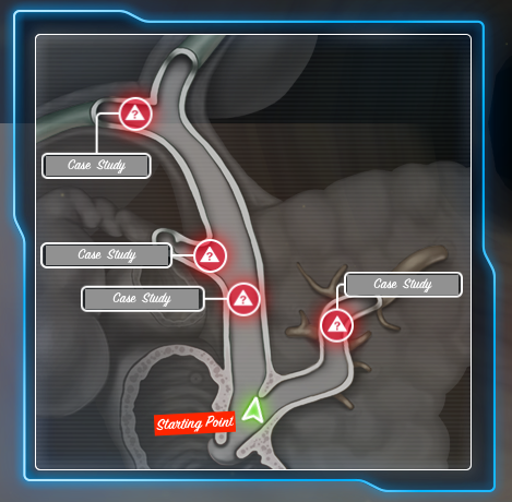
Our first iteration did not have a minimap, like the one below. As a result, early players didn’t understand that the goal of the game was to get to the case studies. They were too interested in simply navigating through the intestine. To solve that problem — after all, Boston Scientific’s goal was to educate players and test their knowledge — we created an interactive minimap that showed users exactly where they were, and which case studies they needed to navigate toward.
In this minimap, the green object moves as the user touches the navigation controller. As soon as the user interacts with a case study it disappears, and the player navigates to the next case. To simplify navigation, we limited movement so the user could only travel in the z and x directions. If the player navigated toward a case study, raycasting would trigger the case pop up.

While developing the navigation, we did a lot of testing with our own employees. We discovered that first time users typically would get stuck on walls or spent most of their four minutes — remember, this game is timed — just moving around. Since Boston Scientific wanted users to learn about their product we simplified navigation to accommodate users with differing levels of skill. (Some users were experienced gamers while for others interactive game-play was outside their wheelhouse.)
Because of a very accelerated schedule we didn’t have time to flip the minimap. As a result users were sometimes confused when they turned completely around within the game — when they reached the end of the bile duct but needed to go back to the beginning. Future releases will address this minor issue.
Controller
This was another area of confusion to our early testers. We built a custom controller so the user rides along with the camera. On first try, we found players didn’t understand all of the controller’s features so they couldn’t navigate most efficiently.
Controller Version 1: Many users didn’t realize they could move diagonally.

Controller Version 2: Our revised design offered greater clarity. Users now understood they could press the diagonal arrow to move forward or backward and at an angle. (Speed was multiplied by the distance a player was from the center on the controller.)

Action
Earning points meant answering questions correctly. The questions were activated when the camera ran into an object. We tested for collision and brought up a pop up containing an overview, and then a series of three questions. With a running clock, a question screen would appear, a response screen would then reveal a player’s chosen answer, and finally the correct answer with a brief explanation would appear.
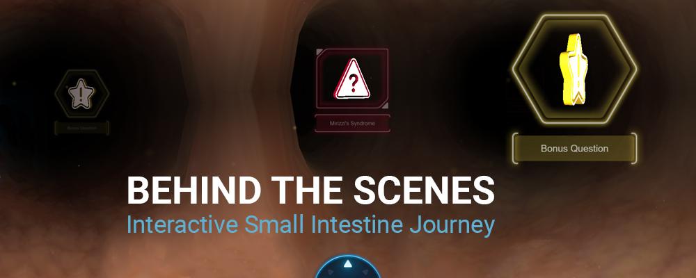
Bonus questions were unique. They were not shown to the user in advance. This added an element of randomness to the game. The bonus questions varied in length and time between 15 and 30 seconds. A player’s score depended on how quickly he or she answered the question.
We also added simple animation on some elements to enhance the game-like experience. The most buzzed-about animation was the counter, which tallied the score as a player earned points.

Responsiveness
The large kiosk-based touchscreens used to present the game in Boston Scientific’s trade show booth are not quite as responsive as an iPad, which initially confused some players. In fact, we had to use javascript to disable browser options when users accidentally held two fingers on the touchscreen. A related challenge: touchscreens have their own way to highlight user interactions. We couldn’t change the device interaction so had to find ways to work within these parameters.
Customization
We templated all questions and answers so that we could used json to populate the game. This makes updating content or changing timing simple so Boston Scientific can easily modify the game for other shows. However, revising the duct texture or minimap require the time of one of our UX designers.
Data capture
We used localStorage to keep track of users, scores and incorrect/correct answers. We used web services to post scores and usernames to a remote leaderboard.
Results
Boston Scientific’s bile duct game helped drive traffic to the company’s booth, and generated a lot of positive chatter at the show from attendees — and even other exhibitors. That’s a big win.
If you’d like to check out the game — or discuss creating a custom game experience for your company — drop us a line at info@ics.com.