With over 20,000 downloads in the first month, and now featured as a Microsoft "staff pick," Snow Report and Trailhead on Windows Phone 7 help users explore their ideal outdoors adventure at ski resorts and on trails.
Letting consumers experience what your brand is like—before they buy—has always been a marketing challenge. Now companies have something new to add to the marketing mix: mobile apps. Unlike ads or product giveaways, whose costs rise in line with the number of impressions, the incremental cost of running an app again is zero. Also unlike ads, mobile apps don't force themselves on consumers when consumers would rather pay attention to something else. Consumers will eagerly use a great mobile app over and over again simply because they want to. And because the apps are mobile, they are also more integrated into people's lives. The product brand becomes part of the person's brand—making an actual product purchase much more likely.
We could not be more pleased with the work ICS has performed. The project was virtually effortless on out part. The apps truly extend The North Face experience to an important new platform. We say 'Never Stop Exploring', and these apps fit that mission perfectly.
- Bill Jones, Vice President Global Marketing, The North Face ®
Mobile apps are therefore a logical choice for The North Face, the well-known maker of outdoor high-performance apparel, equipment and footwear. The North Face sells products, but it markets a lifestyle, which it constantly reinforces by "sponsoring expeditions to some of the most far-flung and still largely untouched corners of the globe"—and also through its mantra: Never Stop Exploring™.
It was in that spirit that The North Face asked ICS to implement two mobile apps for Windows Phone 7: Snow Report and Trailhead. The first lets users easily access the latest ski conditions at their favorite resorts. The second is a community-based app that lets users map trails they've traveled, leave photos and comments at points of interest they mark on the map, and also share their trails with other users.
Both apps are recreations of previous iPhone implementations, taking advantage of unique Windows Phone 7 features—in particular the tile design of the Metro user interface. The Windows version also called for highly optimized use of memory—for example, to handle cases when the user leaves the application and comes back to it later. Even though by then the application may need to be restarted, the earlier memory state is restored, and for the user it seems as if the application never stopped.
Both apps were done from scratch over the same six-week period with only the iPhone versions (but not the code) and APIs available as a starting point.
Snow Report — Effective Use of Tiles
![]() Moving an app to a new platform is often more than just an opportunity to expose the app to a wider audience. It's also a chance to make significant improvements in the app itself. In Snow Report, ICS took advantage of the Windows' tile interface to help users access ski resort information quickly. Using the tile interface enables the application to present a lot of information all at once using [Snowreport icon] multidimensional data without requiring any drill down. On its front, each Snow Report tile represents a ski resort with snow condition, snowfall over the previous three days, and current weather graphically displayed. Turning the tile over reveals the weather forecast, ski conditions and surface conditions. To get all this information without tiles, the user would have had to navigate lists, which takes time, is confusing and, frankly, is not much fun.
Moving an app to a new platform is often more than just an opportunity to expose the app to a wider audience. It's also a chance to make significant improvements in the app itself. In Snow Report, ICS took advantage of the Windows' tile interface to help users access ski resort information quickly. Using the tile interface enables the application to present a lot of information all at once using [Snowreport icon] multidimensional data without requiring any drill down. On its front, each Snow Report tile represents a ski resort with snow condition, snowfall over the previous three days, and current weather graphically displayed. Turning the tile over reveals the weather forecast, ski conditions and surface conditions. To get all this information without tiles, the user would have had to navigate lists, which takes time, is confusing and, frankly, is not much fun.
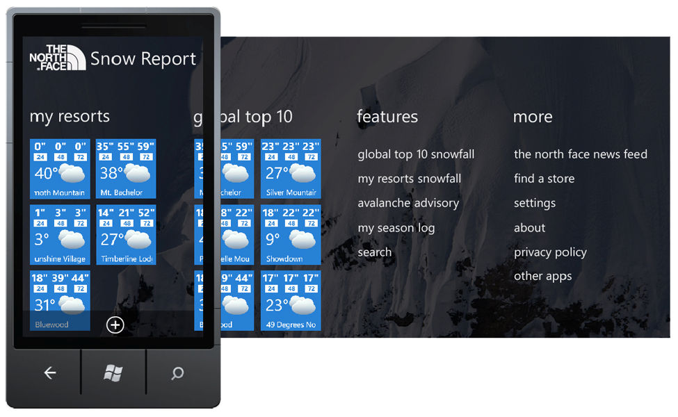
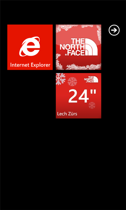
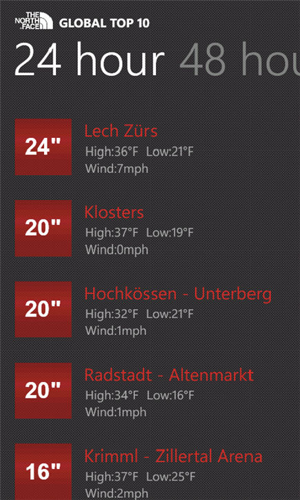
Tiles inside the Snow Report app, called "secondary tiles," have the same look and feel as "primary tiles" on the home screen, thanks to a Windows feature called a hub tile. Any secondary tile can also be "pinned" to the home screen so the user sees updated ski conditions just by looking at the phone. The app comes with tiles for the world's top ten ski resorts pre-installed. Touching a tile and hitting the delete button brings up a search screen that allows the user to replace that tile with one for a resort that the user prefers. See a demo here.
Trailhead — A Trailblazing Implementation
In Trailhead, ICS also faced the challenge of how to present and let the user manipulate a significant amount of information—not just in a confined display but also in confined memory. That includes maps, and pins users place along trails, which they push to insert or see photos or text comments. The app draws a trail automatically from the phone's GPS coordinates. Users can also rate trails based on the number of user votes or the number of times users select a trail. A search feature lets users find trails based on activity (e.g., hiking, biking, climbing), keyword, or proximity to the user's current location or a location the user enters. There's also an edit feature that lets them update trails—either their own or ones they have downloaded from a worldwide database of thousands of trails shared with the entire Trailhead community.
![]() All these map-based features add up to a substantial amount of information and processing—creating maps, drawing trails, keeping track of photos and commentary, and displaying all that information on demand. Without effective optimization, merely launching the application could have caused the user to wait a long time for maps, photos and other objects to populate the screen. Another optimization challenge was how to preserve the user's place in the app if the user decides to leave it to use other apps. Users would expect to go right back in and literally "pick up the trail" where they left off—not to start from scratch all over again. The ICS implementation allows for this—even though Windows Phone 7 may discard the application from the phone's memory when the app is not actually in use. See a demo here.
All these map-based features add up to a substantial amount of information and processing—creating maps, drawing trails, keeping track of photos and commentary, and displaying all that information on demand. Without effective optimization, merely launching the application could have caused the user to wait a long time for maps, photos and other objects to populate the screen. Another optimization challenge was how to preserve the user's place in the app if the user decides to leave it to use other apps. Users would expect to go right back in and literally "pick up the trail" where they left off—not to start from scratch all over again. The ICS implementation allows for this—even though Windows Phone 7 may discard the application from the phone's memory when the app is not actually in use. See a demo here.


No Button Clutter
In both these apps and, in fact, in all Windows Phone 7 apps, both Microsoft and ICS place a big emphasis on intuitive design. Effective use of tiles and in-memory optimizations are but two examples. A third is the lack of screen clutter. Everything must be done through an application bar which is limited to two or three visual buttons. If more menu selections are needed, the bar expands to show items in plain text. That way the user doesn't need to go looking for "missing" features that are actually present in the app but whose controls are not obvious.
The result is great user experience for the consumer and a great implementation experience for The North Face. "We could not be more pleased with the work ICS has performed," said Bill Jones, Vice President Global Marketing. "The project was virtually effortless on our part. The apps truly extend The North Face experience to an important new platform. We say 'Never stop exploring,' and these apps fit that mission perfectly."