Is the Future of UX Design Super Minimal?
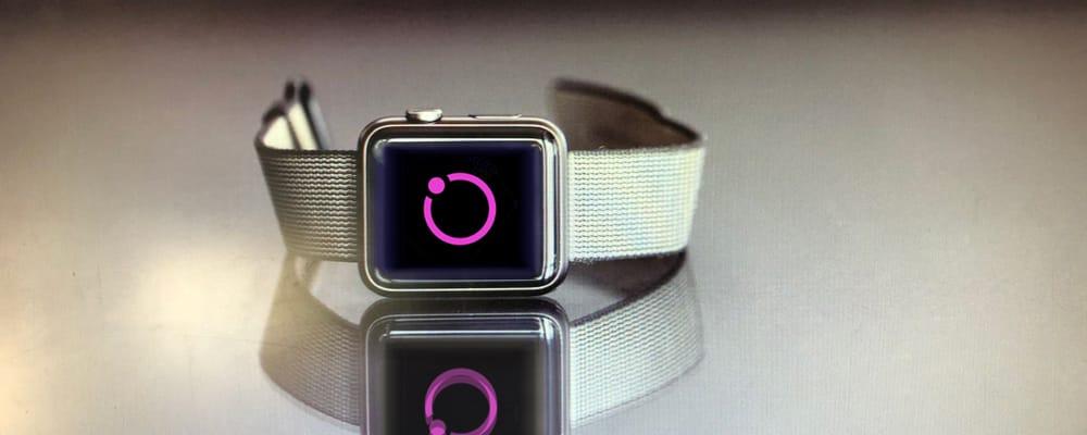
We’ve become accustomed to minimalist design in app and web design. But with the Internet of Things (IoT), the trend in user experience (UX) design is toward even more extreme minimalism, at least on consumer side. Consider a few of the most well-known IoT products out there – FitBit, Nest Thermostat, Amazon Echo. They all have very simple interfaces, paired down to the most basic and necessary elements.
The Rise of Super Minimalism
Minimal UX design style gained momentum in the mid-2000s. This style is characterized by simplicity, clarity and functionality of every element with nothing extraneous. Although there is precedence for minimalist style in art and design, minimal UX design style may have emerged at that particular time for several reasons. In the 1990s, we had a romance with excessive graphics, animation and video as increasing performance and resolution enabled us to go a little nuts with the digital medium and create full, rich expressions of the GUI. William Gibson’s popular 1982 short story, Burning Chrome and later 1984 novel, Neuromancer brought to our consciousness the idea of an expanding “cyberspace” of a fully rendered 3D world, and drove the enthusiasm for attempts at recreating reality.
Minimal design felt like a reaction to the visual and aural excesses of the 1990s. At the same time, it could be seen as the realization that ease of use was not tied to creating a vision of physical reality, in fact it was often the opposite as performance limits and screen clutter was pushed to the maximum. But possibly most influential was the emergence and our subsequent love affair with mobile devices, which require a pared-down aesthetic to fit on smaller screens and accommodate the larger target sizes of touch interaction.

The Swinging Pendulum
One might have thought that UX design style would swing back the other way about now, back to attempts at recreating reality as power and performance has increased even more. But that hasn't been the case. Instead, niches have been established.
Complex user experiences will always have a place in professional applications that require special knowledge and skills. Virtual reality is still dependent on creating a replica of physical reality. Mobile devices have retained minimal design. But something interesting is happening with IoT devices. They are often even more minimal than we have grown used to – super minimal.
Here are a few reasons why super minimalism is on the rise:
-
Even smaller screen sizes than mobile or no screen at all.
-
The innovation of speech interfaces, often without screens (which completely masks the amount of complexity behind the ability of a device to converse).
-
Mixed modal interactions, which seem to lend themselves to very simple visual interfaces or otherwise the visuals dominate the experience. (But there are questions: will speech become the unifying modality? The GUI or a screen with a visual interface has been the unifying modality on devices up until now. Will it remain so? Speech and touch can both be simple and natural interactive modalities, but speech doesn’t require a visible interface which lends itself more to super minimal design.)
-
Expectation of good performance – today’s users have no patience for delayed responses.
-
Expectation of ease-of-use or natural user experiences – today’s users have no patience for a UX that is obscure.
-
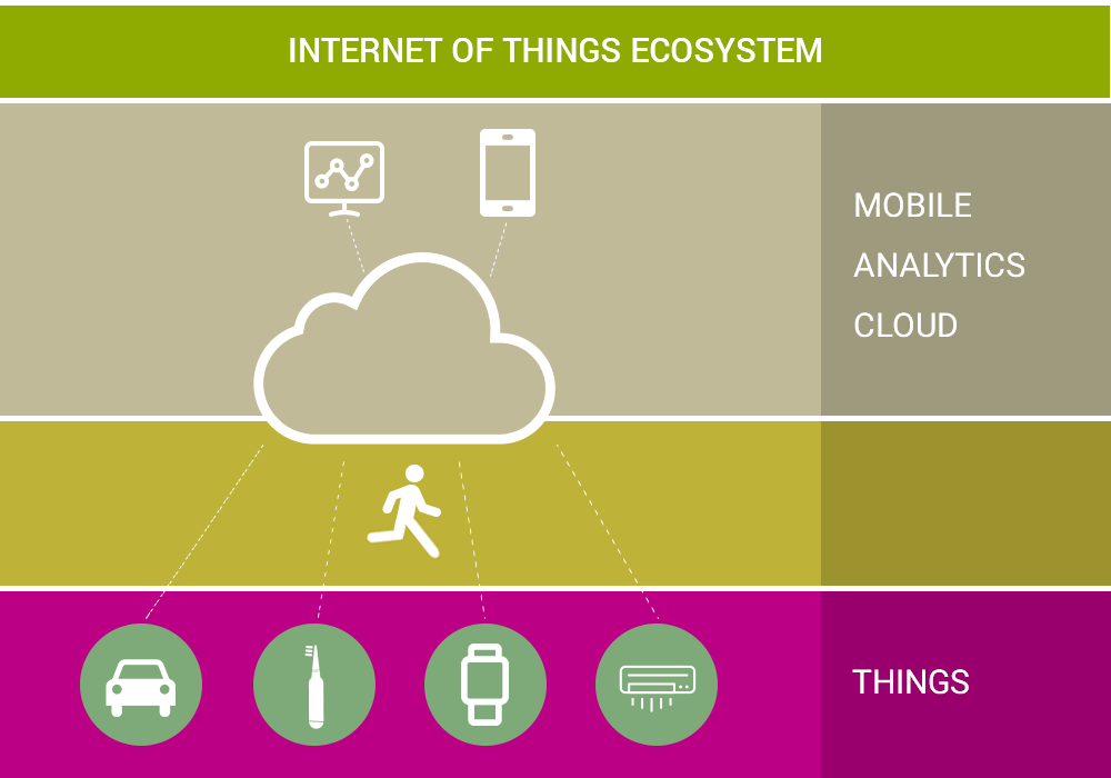
The ecosystem of ubiquity. Experiences happen across several connected device types, so some can have very limited interfaces while others may be more functional. For instance, you might have a smart watch (super minimal) that you also sync with your car (minimal) and your laptop.
As the technology of interactivity gets more sophisticated, user experiences can get more natural and easy for humans. Super minimal design is possible and desirable for IoT devices, hiding vast complexity behind the simplicity.
Like this blog? Click here for more great UX content.